Collegiate athletics branding from scratch
Developing a new collegiate athletics brand that looks like it belongs in the big leagues
Most colleges have a mascot and athletics identity that has been around for as long as the institution itself. Bob Jones University, a private faith-based university in Greenville, SC, is an exception. Started in 1927, Bob Jones College began playing football against local colleges and high schools under the name “Swamp Angels.” Depression-era finances and other factors caused them to stop the intercollegiate program—until 2012. With a desire to unify the university family and expand the academic programs into sports-related sciences, the university decided to re-enter athletics. “Swamp Angels” no longer seemed like a good fit, so a committee was established to select a new mascot. The final selection, “Bruins,” was kept secret, and I was given the task of developing the new identity and rolling it out. The rollout itself was a major event, but my focus here is on the development of the new identity. I began with an in-depth analysis of what collegiate athletics programs look like, and pulled together the creative teams to begin developing our direction. We paid close attention to the (few) other sports teams that used the Bruin name, as well as any team with a bear-related mascot. 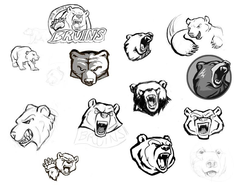 After an initial kickoff brainstorm meeting, our illustrator began developing the bear image while the rest of the team started concept development with typography, color and design themes; a half-dozen designers participated in the process. We aimed for a very professional and contemporary presence with an extensive palette and flexible variety of images. This proved to be challenging. A bear illustration, for example, can easily be too cartoonish, too childish, too fierce, too frightening; we wanted to project confident intimidation without getting gory.
 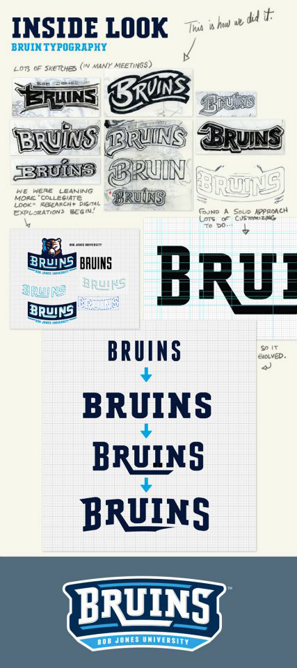 Typography required custom typefaces. We wanted an old-school collegiate feel with a modern touch, and found nothing that fit exactly. I developed two versions of the font in FontLab Studio; a simple face, plus a decorative face with a drop shadow. We settled on three major logo variants: the bear head, the logotype, and the full logo with both together. Several alternates were created, including a paw logo and children’s “Baby Bruin” logo. The palette developed into four major colors plus white. A secondary palette of four additional colors were selected for flexibility, especially in merchandising. As the concepts began to gel, our attention turned to implementation. Most college athletics programs have decades to build up a campus presence; we wanted to create that atmosphere overnight (literally). We made plans for a visual overhaul of the campus field house, stadium, and store. An athletics contract with adidas led to development of custom team uniforms and then guided merchandise decisions, and I set up licensing of the brand through LRG (now Learfield Licensing). We created a full identity guide to guide the new athletics department, the rest of the university, and licensees in implementation. The image has been received with extremely positive response; merchandise sales have been brisk, and the campus is unified around their new identity. The following year, the BJU’s women’s soccer team won the NCCAA Division II national championship wearing the new brand.
![]()