Rebranding Higher Ed
Replacing a 45-year-old identity to strengthen brand perception
The landscape of higher education is littered with failed rebranding campaigns. Some of them are truly spectacular failures, such as the public uproar over the UC logo that led to it being pulled back. Yet marketing has become big business in higher ed, and branding is a centerpoint of the marketing discussion.
At the heart of branding is the academic visual identity, which includes regalia and the mace and the campus itself; and the heart of the visual identity are the graphic marks that represent the university. ![]() Bob Jones University used this logo forty-six years, but by 2013 it was dated and didn’t communicate what we wanted. Most commonly, we heard that it didn’t look collegiate. That led to a different design on executive stationery, and eventually we had several identities, each with their own logos, fonts, and letterhead. Our visual identity was disintegrating.
Bob Jones University used this logo forty-six years, but by 2013 it was dated and didn’t communicate what we wanted. Most commonly, we heard that it didn’t look collegiate. That led to a different design on executive stationery, and eventually we had several identities, each with their own logos, fonts, and letterhead. Our visual identity was disintegrating.
I studied everything I could find on the topic—academic papers, white papers, case studies; studied those that have done it right and those that have really botched it (which are plentiful); and dug into our history. Research shows that when done carefully and correctly, rebranding can reinforce core values, speak to historical foundations, position the quality of academics, and help shape positive perceptions. Finally, if done correctly, a new visual identity can ease employee fear about ongoing organizational change.
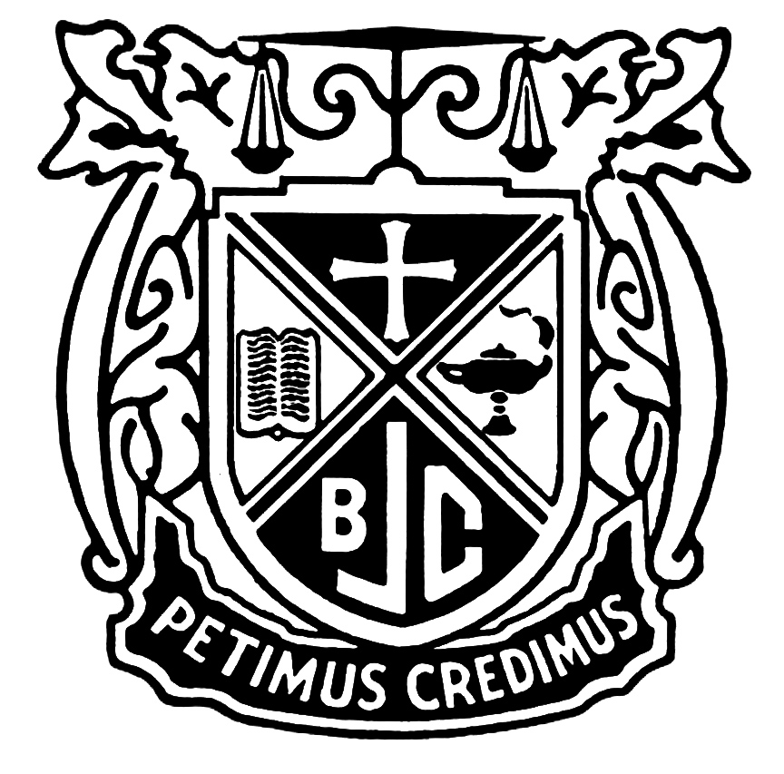 Then I began digging into BJU’s visual “roots.” I centered on BJU’s oldest element, the crest. It contained three elements representing what mattered most to the institution: the cross, speaking of Christ and our redemption; the book is the Word of God; the lamp is the light of Truth. Those three virtues were not exclusive to BJU, so they were gathered around a group identity illustrated by the school initials, BJC. For this rebrand the school identity was no longer limited to initials, however; BJU adopted a new mascot, the Bruin, to represent itself. These four elements became the heart of our new identity.
“Logo equivalence” is the term applied to logos of companies in the same industry that look similar to each other. In commercial branding, logo equivalence is a bad thing; Apple certainly doesn’t want to look like Microsoft. However, logo equivalence in higher ed is an indicator of quality.
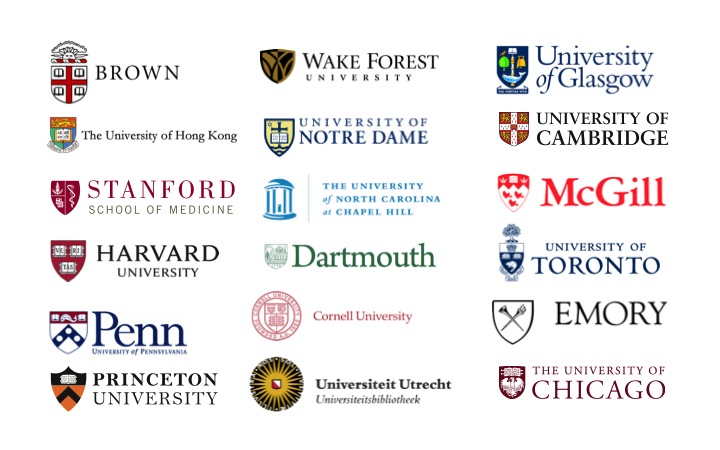
In fact, 97 of the top 100 universities in the US look like this: a shield on the left, logotype on the right in a classic serif font. My design team, headed by the inestimable Will Meadows, began working on a shield that would feel at home with the existing crest and communicate our position as a leader in faith-based liberal arts education.
We selected the impeccably elegant Requiem font family as the basis for a logotype. The font is very similar to Trajan in its capitals, but it has the huge advantage of lower-case plus dozens of weight and stylistic variants. With a shield and a logotype, we had the pieces in place.
As I mentioned, the number and cost of higher-ed rebrand failures is staggering. Analyzing the failures led me to be extremely careful in development and rollout. We looked for extensive input and feedback from many audiences, including a group of designers and artists. As we identified people who were likely to be change agents or obstructionists, we brought them into the process to give them a sense of ownership and an opportunity for input. We carefully managed the communication about the project to the executives, deans, and on through the organization.
The new identity was rapidly adopted with no resistance and feedback was entirely positive. Sales of branded merchandise instantly increased several times over. The rebranding extended to new collateral, including viewbooks and advertising, with positive returns.